Through the 1980s and 1990s, Mega Man was the smiling face at the front of one of Japan’s most recognisable franchises. Distinguished by its bright, colourful, graphics and tough jump-and-shoot action that positively demanded skill and precision, Capcom’s Mega Man series was something of a games industry mainstay: through successive generations of consoles and changing fashions, Mega Man kept moving and changing with the times. That is, until 2010, when the series went through its own miniature version of the Dark Ages: Keiji Inafune, one of the key figures in the franchise’s creation, suddenly left Capcom when several Mega Man projects were abruptly cancelled.
For eight years, a once prolific series seemed to be in danger of vanishing altogether, but now the Blue Bomber is back in a new adventure: Mega Man 11, a much-anticipated sequel that emerged to solid reviews in October 2018. The tough, precise platforming of old is present and correct, but now the action’s realised in fluid 2.5D running on Capcom’s proprietary MT Framework engine. It’s the latest example of a franchise that has changed its visual style and approach, even as the action has, at least in the main series entries, largely remained true to its roots.
So how has Mega Man changed since 1987, and how does Mega Man 11 reinterpret the series’ style for a new generation? To find out, let’s start by going right back to the beginning to see how Mega Man’s themes and ideas were first established.

The original Mega Man game: with his detailed sprite and movement, the Blue Bomber was one of the first anime-style console heroes.
The 1980s birth of Mega Man
The original Mega Man was cleverly designed around the technical limitations of the Nintendo Entertainment System. Given the task of making an original game tailored for the 8-bit console, director Akira Kitamura and artist Keiji Inafune, then fresh out of college, took inspiration from Japanese anime for both Mega Man’s design and story. Specifically, they were inspired by Astro Boy (or Tetsuwan Atom), a hugely popular manga/anime series created by legendary artist and animator Osamu Tezuka.
Like Astro Boy, Mega Man is a sci-fi reworking of Pinocchio: set in a future where robots exist alongside humans, it relates the story of an artificially intelligent boy created by a good-hearted scientist. Tezuka’s signature style of appealing, large-eyed characters was also a clear influence on Mega Man, both in the lead character and the army of enemies he encounters on his adventures. Even the Robot Masters, the game’s area bosses, are distinctive and likeable, although they are determined to brutally thwart the player’s progress at every turn.
What’s most impressive is just how well Kitamura and his small team of young artists and programmers managed to capture the style of anime on the NES hardware. Mega Man himself is an expressive, determined little character, with his facial expressions changing as he runs, jumps, or reacts painfully to enemy attacks.
“The [Mega Man] character is really based on Japanese animation,” Keiji Inafune told Play magazine in 2004. “And when we were making him, at the time, Nintendo games really did not have a huge focus on the characters. We wanted to make sure that the animation and the motion was realistic and actually made sense.”
Such a level of detail was quite unusual for the time, partly because of the NES’s colour limitations; each sprite could only contain three colours (with a fourth reserved for transparency), which is why Mario, in his first outing in 1985, is comprised entirely of red, brown and beige pixels. (Note how in Super Mario Bros, the Italian plumber’s face remains unchanged whether he’s running or jumping.)
In Mega Man, on the other hand, programmer Nobuyuki Matsushima cleverly got around this limitation by building the hero out of two sprites: his body is one sprite, and comprises two shades of blue and black. His face, meanwhile, is a separate sprite, drawn from white, black, and beige pixels. This workaround, plus Kitamura’s simple yet dynamic four-frame run cycle, helped make Mega Man stand out from the other platform game heroes crowding onto the NES in the late 1980s. Indeed, the design and animation in the first Mega Man game was so successful that it remained almost unchanged in the franchise’s initial salvo of five sequels, released on the NES between 1988 and 1993.

The games may be in his name, but without the rest of the cast, Mega Man wouldn’t be as loved as it is.
The Blue Bomber in the 16-bit era and beyond
Despite the departure of Akira Kitamura in 1988, following the completion of Mega Man 2, the series continued to grow in popularity under the guidance of producer Tokuro Fujiwara and artist Keiji Inafune. Indeed, the franchise began to expand to a quite bewildering extent through the early 1990s, with the mainline series joined by a number of spin-off strands and remakes. One of the most notable spin-offs was Mega Man X, first released for the Super Nintendo in 1993. Set long after the classic series, it took a much harder-edged and darker approach to its design.
As planner and artist, Keiji Inafune set about creating a new look that would fit with the expanded colour palette on the Super Nintendo: gone was the squat, chunky sprite design of the 8-bit Mega Man games; in their place, Mega Man X went for taller characters with more detailed shading and aggressively-styled animation. By contrast, Mega Man 7, released on the SNES one year later, seemed to go further down the bright, colourful route established by the mainline series. Colours were more vivid thanks to the 16-bit hardware, and background designs contained more detail than ever.
Earlier Mega Man games relied heavily on colour contrasts to help lift the sprites from the background; in Mega Man 7, the backgrounds have depth, texture, and a colour scheme of their own, contrasting cleanly with the foreground characters. Whereas Mega Man X represented a conscious attempt to break with tradition, Mega Man 8 felt like a more natural evolution of the main series’ cheerful identity.

Opinions on the game itself remain mixed, but it’s hard to deny the spectacular visuals on display in Mega Man 8.
The franchise landed on the PlayStation and Saturn in 1996, with the beautiful-looking but sluggishly paced Mega Man 8. In terms of gameplay it was nothing spectacular, but aesthetically it was stunning. All the details that defined the earlier games in the series were present, but polished by newcomer artist Hayato Kaji to a captivating degree: those big, expressive eyes were back; colours were vivid but not garish, while the animation had a likeably elastic, toy-like quality. After Mega Man 8, later Mega Man games made the transition to 3D, most notably Mega Man Legends for the PSone and Mega Man X7 for the PS2 — though the less said about the latter, the better.
While Mega Man spin-offs rolled out of Capcom at a steady rate, the main series didn’t receive a numbered sequel for almost a decade. Released as a download-only title for the Nintendo Wii in 2009, Mega Man 9 was unapologetic in its retro styling, with its 8-bit graphics, sound, and tough gameplay all taking direct inspiration from Mega Man 2. It was a decent enough sequel, but it removed a number of the skills Mega Man had built up over the previous 20 years, as well as restricting its design and animation to the limitations of the 8-bit era.
Tellingly, both Mega Man 9 and the similarly retro Mega Man 10, released in 2010, were co-developed by Inti Creates – an external studio set up by former Capcom staff. Inti had worked on a number of Mega Man spin-offs for the Game Boy Advance and DS earlier in the 2000s; as Capcom concentrated on bigger, newer franchises like Resident Evil and Street Fighter, its interest in the ageing Mega Man series appeared to be on the wane.

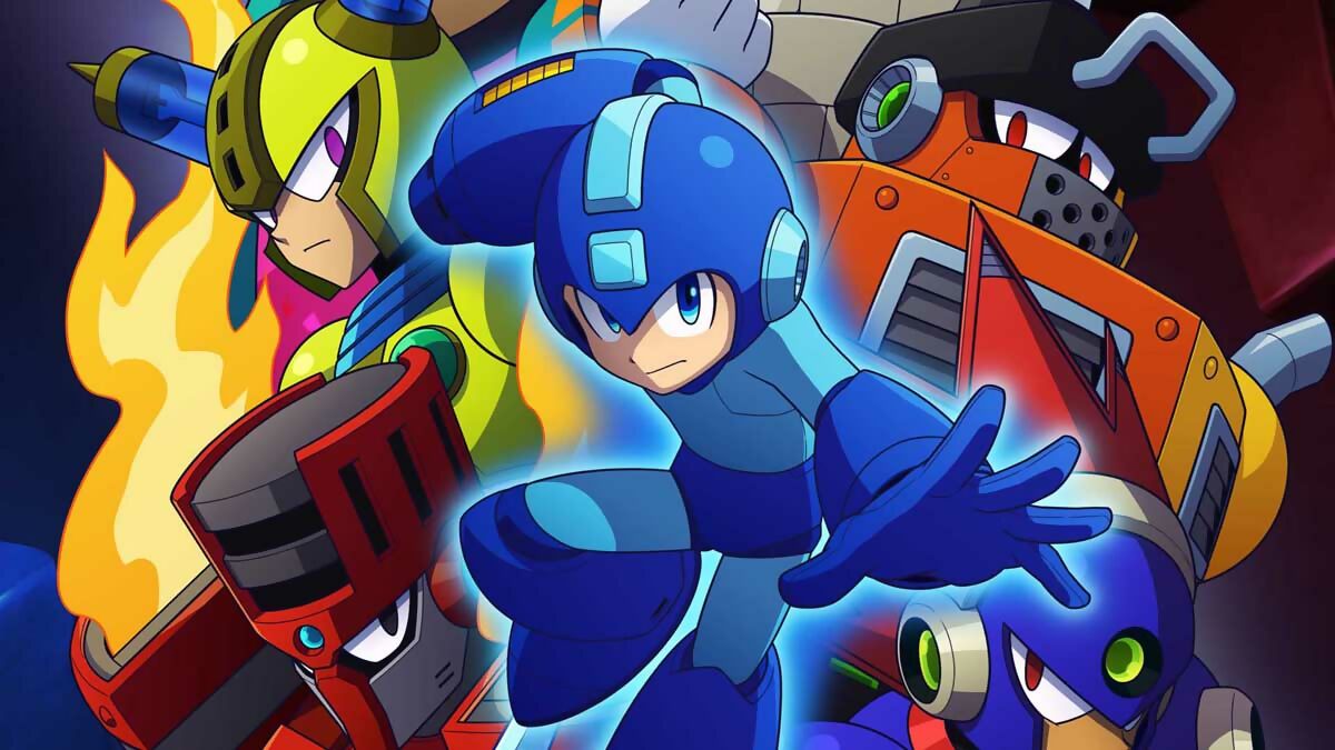
This year’s eagerly awaited Mega Man 11 sympathetically updates the sprites of the early games into cel-shaded 3D.
Mega Man 11
So here we are 30 years later with Mega Man 11, the latest instalment in the original series, and it retains the earlier games’ sense of cartoon-like style remarkably well. As we’ve already seen, Capcom’s previous attempts to create an anime-style look using polygons were mixed, but as time has gone by and techniques have improved, so too has the use of cel-shaded graphics. The character designs were drawn by Yuji Ishihara, who originally worked on Mega Man Legends in the mid-1990s, and his 2D illustrations have been sympathetically rendered into 3D.
The majority of shading and lighting on the character models is reduced to a simple dark edge or a small light spot, and although the animation is much smoother than it was in the 1980s and 1990s, it retains much of the same stripped-down charm. While it’s no secret that some critics have expressed displeasure at a few of the game’s animated elements – Mega Man’s run cycle appears to be particularly controversial in some online quarters – they’re relatively minor flaws when weighed against the game as a whole.
Mega Man 11 uses 3D models instead of hand-drawn sprites, so movement can be tightened and controlled in a wholly different way. The game has a precise feel, and flows as nicely as any of the NES games – rather unlike Mega Man 7 or 8 – and this is down to tight animation timing. As the game runs at 60 frames per second, the designers have been able to fit in some really concise information into a small amount of time without the need for labour-saving techniques like smearing. This doesn’t mean that all the classic charm is absent – quite the contrary, in fact. The Robot Masters feel as cartoony and playful as ever, striking exaggerated poses and generally moving with weight and purpose.
Mega Man’s use of visual effects are also worth singling out. Even though the whole game is made up of 3D models, effects like blast impacts and explosions are all animated in 2D and at a slower frame rate, which serves to heighten the illusion that what we’re seeing is all hand-drawn. It’s an example of how Mega Man 11’s creators are looking back to the series’ roots and the language of anime that first inspired it.
Mega Man 11 may not be perfect, but it at least feels like a bold new chapter in the series: in touch with the running, jumping, and blasting action of the past, sure, but also keenly aware that so much of the franchise’s charm lies in the quality of its character designs. Mega Man simply wouldn’t be the same without those feeble yet tenacious enemies, or the imposing, charismatic Robot Masters. And then, of course, there’s Mega Man himself: a hero whose personality was so perfectly captured in that first run-cycle from 1987. Feisty, optimistic, and determined to reach his goal no matter how often he’s knocked down.
What’s in a name?
We may know him as Mega Man in the West, but for Japanese gamers he’ll always be Rockman. The Rockman name was originally coined as a tribute to its creators’ affection for rock ’n’ roll music, as well as a reference to the game’s power-up system, which was inspired by rock-paper-scissors. Capcom USA later changed Rockman to Mega Man, but curiously left the name of his sidekick, Roll, unchanged, thus rendering his creators’ original pun (Rock and Roll) meaningless.

Keiji Inafune’s cover artwork for the original Rockman.
The Illustrated Man
A survey of Mega Man’s changing style wouldn’t be complete without a brief mention of the games’ cover art. In Japan, Keiji Inafune designed the covers and manuals for the first few games himself; in the US, Capcom’s anime-averse marketers opted to commission an artist to create some new artwork. The cover for the first Mega Man has long since gone down in history as one of the worst ever. It wasn’t until Mega Man 8 that Westerners got to see a true, anime-style representation of the Mega Man character.