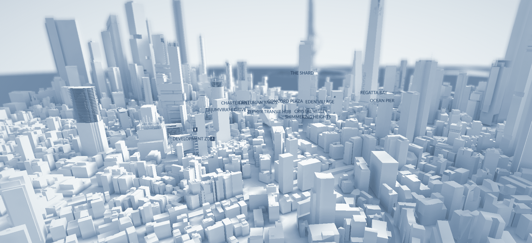
Following the original Mirror’s Edge must have been a tricky task for DICE. The 2009 game was a brilliantly innovative first-person parkour-‘em-up, and its developers didn’t want to simply deliver more of the same for its 2016 sequel, Mirror’s Edge Catalyst. Instead, it made the brave choice of transplanting what was originally a linear experience with rigid boundaries to an urban open world. It was set in the City of Glass: a near-future dystopia inspired by such places as Shanghai, Singapore, and Tokyo.
Erik Odeldahl, design director on Mirror’s Edge Catalyst throughout its roughly five-year development cycle, agreed to share some of the decisions that guided the creation of its setting. Interestingly, Odeldahl left DICE after Catalyst’s release to co-found Fast Travel Games, a VR game dev studio. Thankfully, despite enjoying wearing many hats and doing everything from level design, scriptwriting, and coding, to planning and budgeting, he still fondly remembers working on Catalyst and the city within it.
INITIAL CONSIDERATIONS
When development on a Mirror’s Edge sequel started in 2012, “the team leads had the mandate to shake things up and try something different,” Odeldahl tells us. “Personally, I wanted us to go into a direction that reinforced one of the things I always liked best about the first game – exploration. I wanted to focus more on the cool parts where you have to combine all the moves in your arsenal to get to a specific area. I also really wanted us to build a game with the philosophy of ‘If you can see it, you can get there’. We didn’t quite reach that far, but got pretty close.”
The decision was therefore made to transform the gameplay from the linear, self-contained levels of Mirror’s Edge to fit Catalyst’s new open world. “If you look at each section of the city,” Odeldahl points out, “it still consists of ‘typical’ linear paths that allow you to dash madly forward, but the main thing is that there are lots of them, and that they very often intersect with each other. There are also a lot of areas that have no major purpose for the main narrative, but are built wholly for exploration.”

The city’s architecture predominantly features white surfaces, which make the oranges, yellows, and blues pop out and guide the player.
The team wasn’t exclusively influenced by the first game; for his part, Odeldahl “referenced the Metroid Prime games a lot, but also, less obviously, the Darksiders and Burnout series.”
As for the look and feel of the city, the team didn’t stray much from the ideas developed in the first Mirror’s Edge. They “wanted the city and its citizens to shine, and be superficially beautiful, but at the same time be a starkly sterile place”. According to Odeldahl, “there’s not a single space in it that doesn’t try to sell something to you, be it consumer goods or an image of a ‘better life’. You can see this everywhere you look. Everything is sleek and straight.”
There’s no room for anything but what the city commands, and this “is contrasted by the movement of the Runners, and specifically their physical freedom. They can go where no others can, and can do what average citizens cannot.” On the other hand, while citizens move freely along wide avenues, those same avenues are almost impossible for Runners to cross.
“We experimented a lot with how close or how far away you should be to the streets for instance”, he adds, “but in the end, we realised that [it was more fun] to allow the player to zoom around on the rooftops above the streets. With the exception of the old Underground Omnistat Tunnels, the lowest part of the game you’re ever at is the first street in the first mission. And of course, the game ends at the highest point: on top of The Shard.”
Architecturally, Catalyst retains the style that defined the original game: gleaming edifices of steel and glass, impossibly clean urban vistas, and the striking contrasts of white city and bold primary colours all remain intact. According to Odeldahl, the team never even discussed any alternative styles.
“It was clear from the beginning that we had to start with the sharp contrasts of the first game,” he says, “and bring them forward towards something that reinforced the more developed backstory and world of our sequel.”

Character design, uniforms, and fashion choices tie in and further enrich the city’s aesthetics.
URBAN PLANNING
Handily, one of the team’s concept artists, Nick Leavy, had a background in architecture. “He played a major part in designing the look and layout of each city district,” Odeldahl says. “Even though the player sees the city from above for most of the game, we actually started by building out the network of roads and larger avenues, as well as making paths for high-speed monorails.”
When building the city, the team also wanted the players to be able to see its history. So, Odeldahl says, you “start out in Downtown, the oldest part of the city, and gradually move outward from it, seeing the splendour of the Anchor, clearly built recently, then the construction areas where a new district is being erected, and then the underground, which consists of structures built before the Conglomerate took over.”
“Eventually, you reach Sky City, the pinnacle of the Conglomerate’s Architectural plans in Glass, and an inspiration to the whole of Cascadia. Overall, we wanted Glass to feel like a city that’s trying to erase its past. My guess is that if [protagonist] Faith hadn’t shaken things up so much by the end of the game, the in-world city planners would have started to tear down Downtown, and rebuild it from the ground up in the same style you see in the rest of Glass.”
Narrative requirements aside, the city needed to combine open-world sensibilities, with discrete levels and predetermined mission routes. To encourage players to discover new shortcuts and optimise their traversal of the city, the game allowed for the creation of personalised, shareable time trials. According to Odeldahl, the latter deeply influenced the structure of its spaces. “Most of the level designers had these social challenges in mind when they created the open-world parts of the game,” he says. “We continuously made time trials and placed geotags during development, and challenged each other to beat each others’ times. I know some of the trickier secret pickups placed in the city ended up in locations where someone had previously placed a really hard-to-get-to geotag.” As for the more linear missions, Odeldahl says that these “were always intended to be a break from the more free-flowing stuff on the rooftops, and allowed us to build some intricate stuff that might be more fun to just play once”.

The city’s futuristic style is further emphasised by the shape of its vehicles.
Treating a whole city as an open-world obstacle course was another interesting challenge, as was allowing for flowing, continuous movement across the urban fabric without using the street level. Somehow, though, Catalyst’s long, cohesive city blocks and the city’s many skybridges all felt convincing and logical.
“Combining fun gameplay and making believable spaces is hard,” Odeldahl admits, “but it’s one of those things we never strayed from. The skybridges were one of the earlier things we locked down in the design to be able to connect larger areas with each other, while still maintaining a believable physical separation between them – usually a wide street or a body of water.
“Within the districts, we always started [designing] with silhouettes, and peaks and valleys. What’s the first thing the player sees when they enter a new space? Having defined such matters, the level design team took over and made those ideas playable in a deeply iterative process that required a lot of back and forth, and which eventually also led to scrapping and rebuilding large parts of the city several times until they got them right.”
Landmarks were also used to help guide the player. “The Shard in Sky City, the under-construction skyscraper in Anchor, the edifice where Kruger has his apartment in The View” all provide points of reference as they make their way from one part of the city to another. As for the Runner’s Vision system, it’s almost always available to the player. The design choice to shut it off when the player enters a ‘puzzle space’ was made as the challenge there would be “to find out how to use your moveset to get from point A to point B”.
“Both our game and the first Mirror’s Edge are the most fun when you play through an area the second or third time,” Odeldahl says. “If you don’t know what obstacles will come up in front of you, it becomes really hard to navigate and shave time off your runs. In that sense it’s very much like a racing game.”

Coloured lines subtly indicate to the player which areas are safe to slide down.
Creating a game world with clear boundaries and a well-balanced scale helped the overall experience – in fact, Odeldahl recalls, Catalyst’s city was originally much bigger than the one that made it into the finished game. “As with more or less every game I’ve ever worked on, the design of the game world was initially larger than what we ended up shipping with,” Odeldahl says. “In the case of Mirror’s Edge Catalyst, this wasn’t necessarily a budget or scope decision, but more in line with how big we felt the city needed to be in order to support the gameplay we wanted.
“Early on, we had designs for even more gadgets and tools, and to split up the city in a more Metroid-y pattern, but we ended up cutting away a lot of fat there. The only tools or gadgets that remained in the game from those early designs are the ones that change how Faith moves.”
Several buildings and other areas were also trimmed out of the City of Glass during development, Odeldahl says. “We had plans for one more District based around several really tall skyscrapers. I think we called this one ‘Financial’ in our planning docs. It would involve a lot of climbing, and very early on we realised we wouldn’t be able to make that fun. You’d spend too much time just looking into building façades, for instance. There were also early plans for a section that connected Construction and Downtown, consisting of three- or four-storey buildings and aqueducts, similar to certain parts of the first game. I can’t remember the exact reason this was cut from the game, but it likely had to do with budget and story changes.”
While some larger elements were dropped for various reasons, smaller touches were also added to help create a sense of a living city. The hackable billboards, for example, were devised to “allow the player to deface the Conglomerate propaganda with something they’d designed themselves, and to give players bragging rights via light-hearted social interactions”.
By concentrating on bold shapes, striking contrasts of monochrome, and splashes of colour, Odeldahl and his team created a city that is captivating and immediately recognisable – even if it’s merely glimpsed by players running along its rooftops at breakneck speed.


